Lies, Damned Lies, and Averages
Statistics are misleading, harmful, and destructive. They obscure the data and the actions taken based on them are often detrimental to a significant portion of society.
Statistics are often used in education. We’ll use them to compare students, teachers, schools, types of schools, demographics, states, and nations. We use them to simplify data down to something easy to graph through a common measurement to quickly view how each entity is performing. We attempt to derive meaning from something that has been reduced so significantly that it becomes relatively meaningless.
I do like data and statistics. Data can be extremely helpful for analyzing issues. Statistics used properly can provide insight into the data. They can give us information about our world.
But they can also be used to distort, oversimplify, omit important information, overlook disparate groups, or make invalid comparisons. Sometimes this is intentional and sometimes accidental. Either way, incorrect conclusions made on these facts and statistics can be harmful. In schools, they can affect funding for schools, evaluations for teachers, and education provided to students.
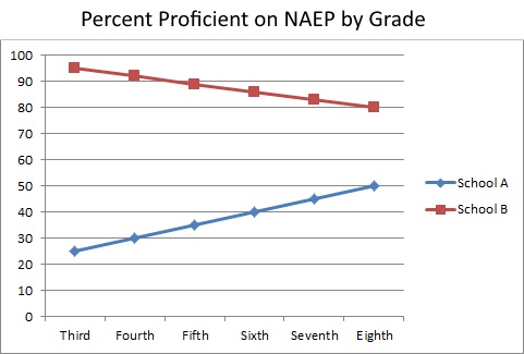
One particularly troublesome statistic used for comparison of school districts is the percentage of students who are proficient on a standardized test. This statistic used to judge schools is often displayed robbed of any context. We know demographics plays a sizable role in academic performance, so using one number to compare low-income urban vs. wealthy suburbs is apples vs. oranges.
Trends are ignored as well. Which school is succeeding: School A where more students are proficient each year but overall proficiency remains low or School B where fewer students are proficient each year but overall proficiency is higher? Would comparing eighth grade scores of 50 for School A and 80 for School B give you a complete answer?
With the change to computer adaptive tests like iReady and Smarter Balanced that can measure growth and not just proficiency, it is certain that new statistics that prove to be equally misleading will be created. School districts will be measured on the percentage of students that made a full year’s growth or the average amount of growth per student. Both hold the danger of overlooking segments of the population.
Examine example data from four hypothetical schools below. Each school has the past year’s student growth by quartile. Each school has the students gaining an average of 1.0 year’s growth. Which school is the best? 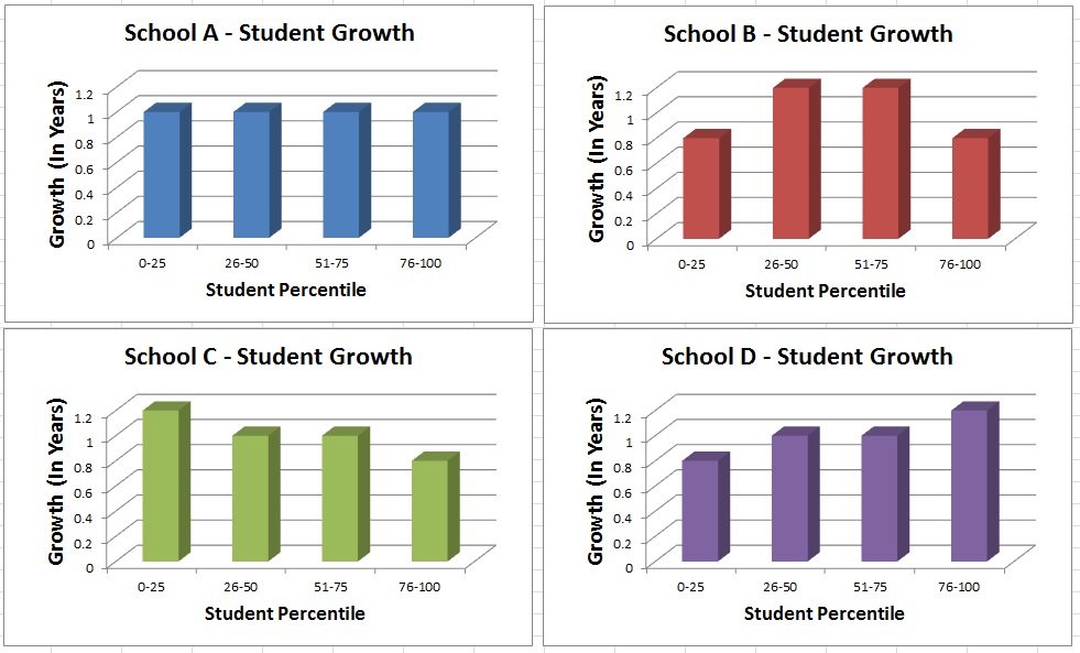 There isn’t a right answer. One could argue that the ideal school is one where every child makes 1.0 year’s growth and School A is best. School B is probably fairly typical when learning isn’t appropriately personalized to the student; struggling students will fall further behind and advanced students won’t be challenged. School C is a school where resources have been shifted away from gifted learners to help struggling learners catch up to grade level. School D is a school where students tend to learn at their natural pace but may not have extremely strong programs for low achievers. For struggling learners, School C offers great opportunities. For the average learner, look to School B for your best growth. School D provides the best shot for the gifted learner. But each school averages to 1.0 year’s growth. The average hasn’t given you the insight you need into understanding where your child will thrive – and where your child won’t.
Perhaps the more important question is what does the graph for the school your child attends look like? Is it meeting the needs of all students or are some not growing? Averages can’t tell you that and the data that can usually isn’t made public. I don’t know that the data is even analyzed to determine if the needs of ALL learners is being met. Looking at the sample reports available for iReady, I did not see any that would show growth based on the percentile of the student on the initial test. In other words, there was no tracking of growth for low, medium, and high achievers beyond expected proficiency for that grade.
The state and federal governments have realized that averages can disguise vital information. They have required data breakdowns detailing how students score on standardized tests by income, ethnicity, disability, limited English proficiency, and bottom 30%. They understand that for schools to be truly successful, they must meet the needs of all these groups and not just bury educational failures in a single-number average. But none of these measures truly track growth for low and high ability students. If a school fails to educate gifted or struggling learners, parents have no way of knowing. Averages obscure the truth.
Standardized testing is undergoing a revolution right now. We are changing from a proficiency-based system to growth-based tests such as Smarter Balanced. This is a great first step, but without effective data reporting and transparency, average growth means as little as the current measures of proficiency. More states are tracking how the lowest-performing students are growing. Some states, such as Ohio, have included a gifted indicator in their scores for each school. These are good first steps, but we need consistent indicators to compare districts within states and states across the nation.
Ask your district administration and your government officials how gifted learners and struggling students are performing compared to other districts and states. If the answer is nebulous, ask them for the data and reports they base their answers on. If they cannot provide this, how do they really know? If even they don’t know, how can you be sure your child is getting the education he or she needs?
Thank you for reading Rochester SAGE. Together we can make a difference for gifted learners!
